Headlines
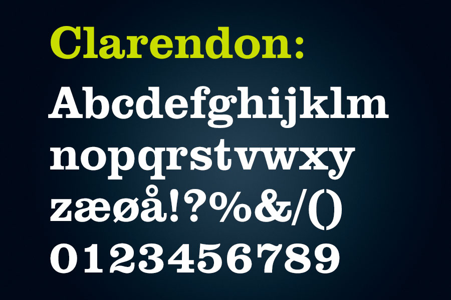
Clarendon is a serious, but at the same time ”friendly”, typography, that stands out and attracts the reader´s attention. On all printed materials, headlines should be set in Clarendon. On the web, one can use a web version of Clarendon on titles, when it is appropriate.

Body text
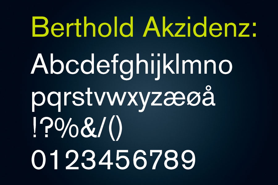
Berthold Akzidenz Grotesk is, on the other hand, a more straight and clear typography, which reflects the professionalism we want to express. On all printed materials, this one is to be used on body texts and when larger amounts of text are produced.

Digital text
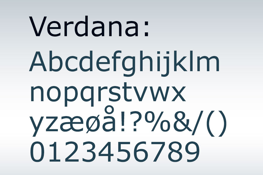
On the web and other digital channels, and for text produced with MS Office tools like Word and Power Point, we need a cross-platform font. For this purpose, Verdana is the chosen one. On the web, one can use a web version of Clarendon on titles, when it is appropriate.
