There are several ways to adjust the pictures to meet this requirement. Which technique one prefer, is individual, and one should also take into consideration the whole context and on what type of surface the image is to be displayed.
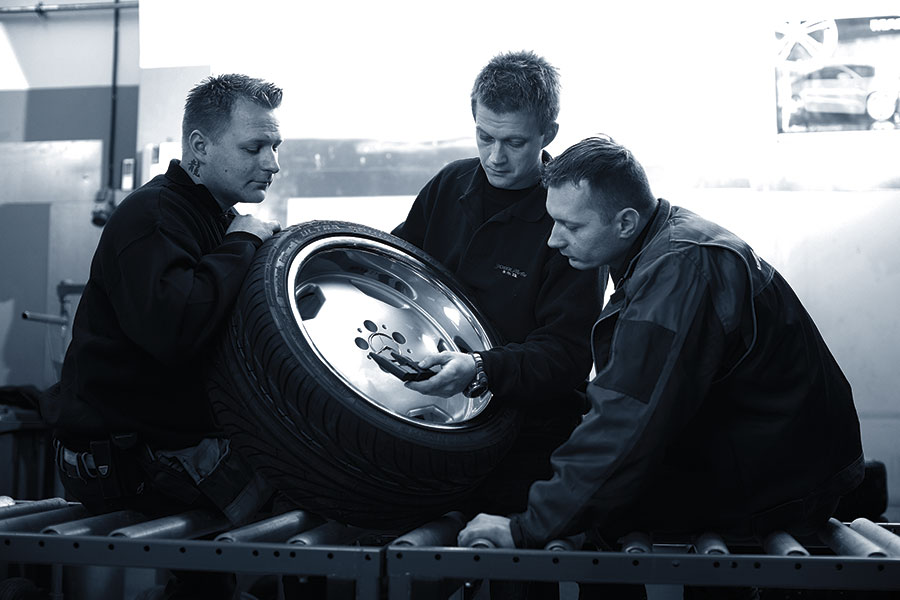
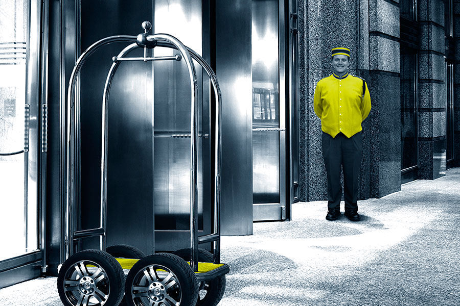
Basically the images are to be categorised in three different styles:
- Brand images – in order to build and strengthen the chain´s identity; The DäckPartner feeling
- Descriptive images – in order to clarify the chain´s business and differentiation. Focus on details.
- Campaign concept images – in ads and so on, to illustrate an overall idea and at the same time underscore our identity and create recognition.
Exceptions can be made when necessary. For example in photos of products and from the garages, where displaying reality is the main focus.
Brand images
These are the visually strongest images in DäckPartner´s photo library. These images shall reflect the brand´s core values, and are meant to cause positive associations. The use of strong, clear images strengthens the visual identity and the position DäckPartner wants to obtain in a market with little differentiation.


Descriptive images
When expertise and product knowledge is the main message, more descriptive images are to be used. Preferably with a focus on details. In an industry with little differentiation, the key is to use close-ups and to emphasize the unique.

Campaign concept images
These are photos taken for advertising purposes, based on a dramatized idea, in order to make the receiver curious and create recognition. The images in this category are the ones furthest away from the general image requirements, and therefore exceptions can be made. When possible, the photos should be blue-tinted, with elements of the profile colour Electric Green.
