Identity through colours
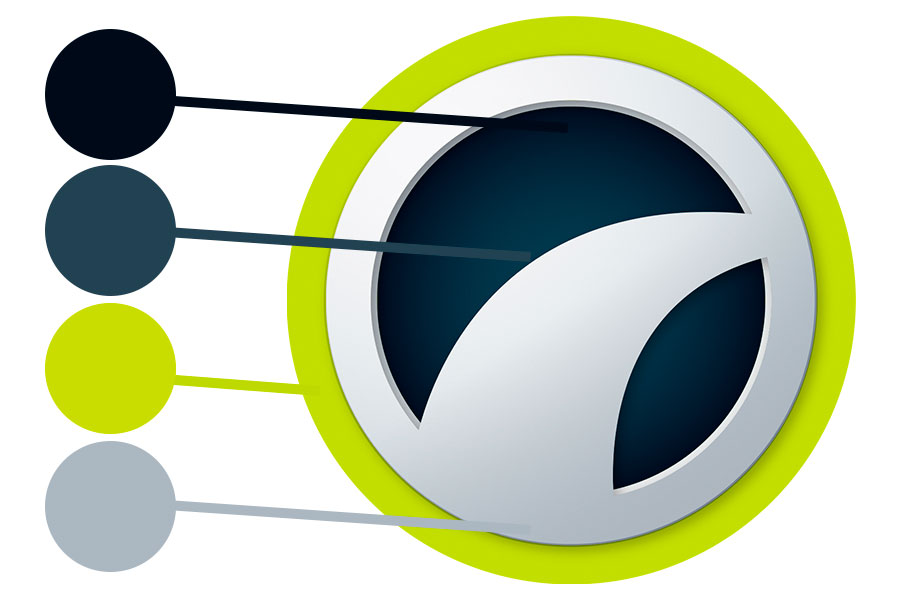
Colour is a powerful means of visual expression. Therefore, it is a crucial way for DäckPartner to distinguish itself in the marketplace. The chain´s logo colour palette is unique to our brand and consists of four clear colours, thus making the identity strong og easily recognisable. Through the use of one signal colour, DäckPartner will light up and be associated with a certain shade – a colour no other business in this segment is connected with.
The colour scheme signals professionalism and expertise, optimism and obligingness, but it has also got an environmental aspect to it.
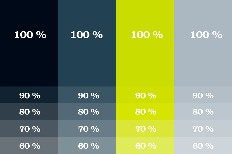
The four colours can be used in the range from 100 % to 60 % tint.
Midnight Blue
PMS: 539
CMYK: 100-65-22-80
RGB: 6-17-30
HTML: 06111e
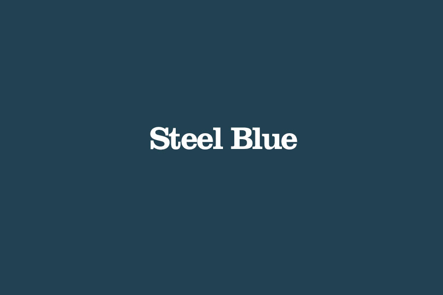
Steel Blue
PMS: 5405
CMYK: 68-35-17-40
RGB: 49-68-82
HTML: 314152
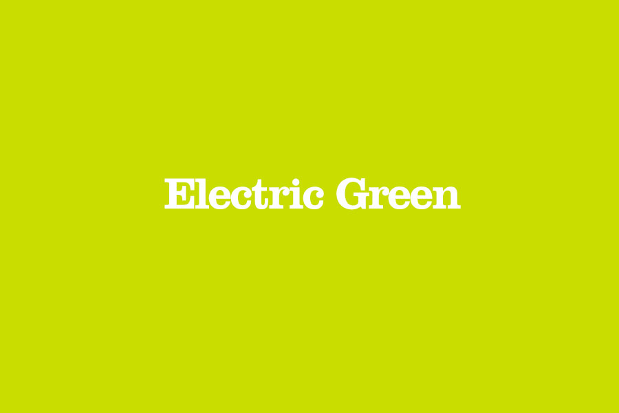
Electric Green
PMS: 381
CMYK: 25-0-98-0
RGB: 206-220-0
HTML: cedc00
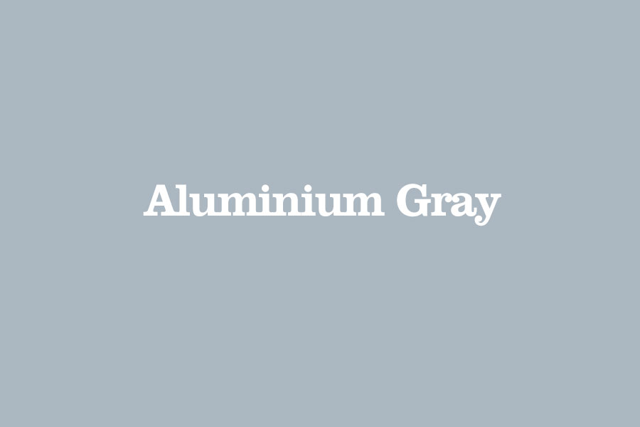
Aluminium Gray
PMS: 7543
CMYK: 24-9-8-22
RGB: 173-182-191
HTML: adb6bf
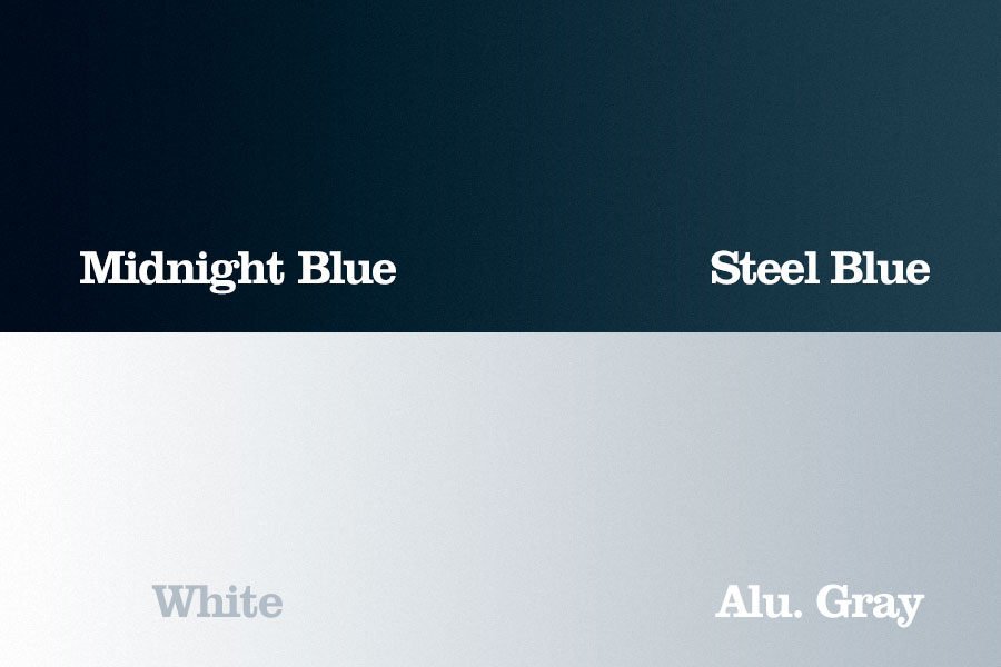
Gradients
Gradients are an important part of the identity and are used to greate the 3D-effect in the symbol.
It can also be used to create a more vibrant apperance in backgrounds.
