The logo is based on Dekkpartner's profile colours, and should mainly be used on dark backgrounds, preferrably dark blue ones, for higher visibility.
The chain´s logo also appears in a version for use on light-coloured backgrounds (a positive version), plus some simplified versions.
The symbol is quite future-oriented and the shape is simple. One can interpret a wheel, a road that disappears into the horizon, and/or a steering wheel. In total it expresses safety and control.
The chain´s name is written in capitals, signalling steadiness and robustness. It consists of the two words ”DÄCK” and ”PARTNER”, separated with different colours for higher visibility and readability.
Primary logo
The vertical, negative lock-up version of the Dekk Partner logo is the primary version, and should always be used when space is not restricting placement. It consists of the chain´s name + a symbol, where the latter is designed to give a 3D expression. In this primary version, the symbol is always vertically centered upon the text.
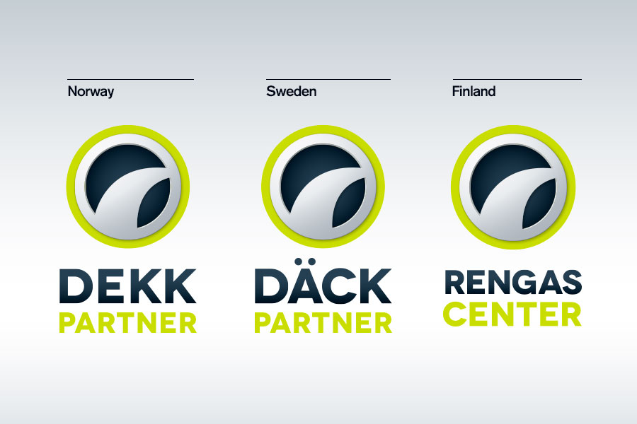
The primary logos for all countries. 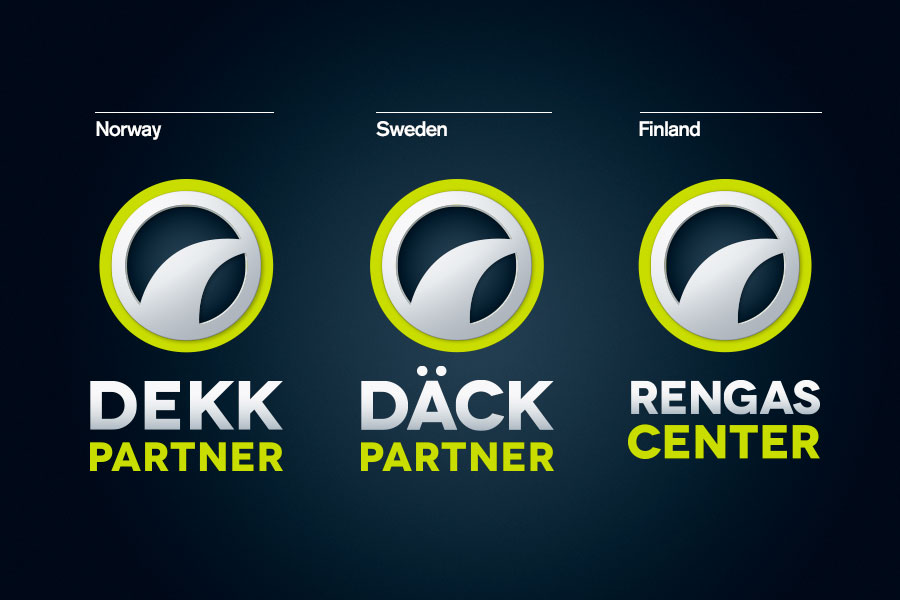
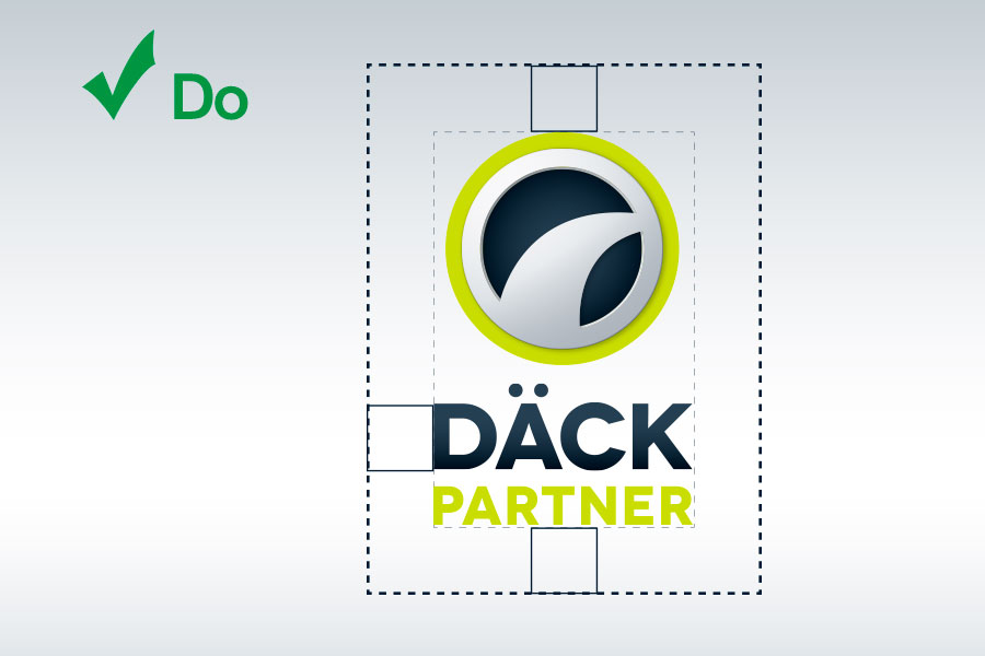
This primary version of the DäckPartner logo is developed in order to be as visible as possible. Therefore it shall always be placed on a dark background. The logo is designed to have space around itself. The exact distance is defined as the x height of the capital ”D” in ”DÄCK”. Text or graphics should come no closer to the logo than is indicated in this example.
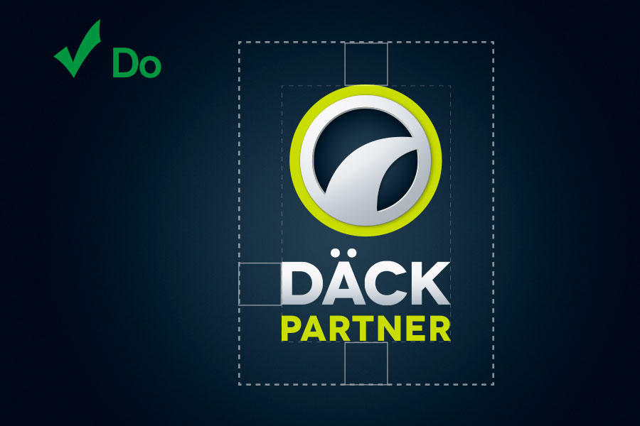
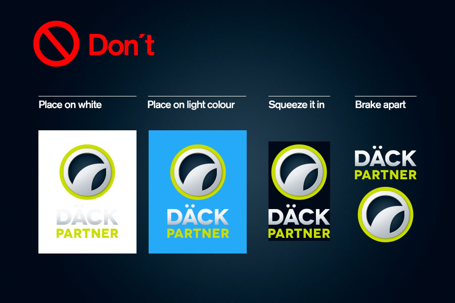
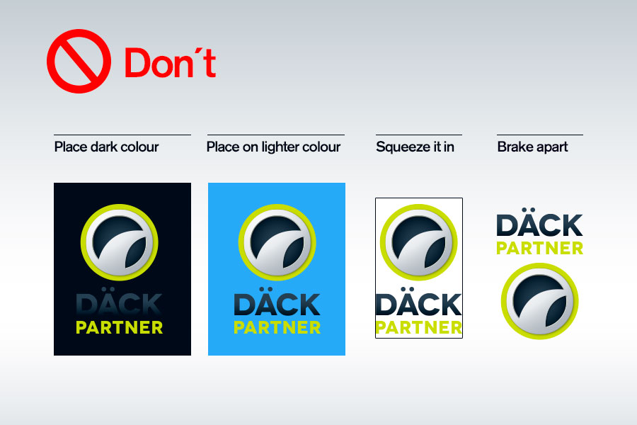
It shall NOT, under any circumstances, be put on a white or any other light-coloured background. The symbol and the name shall never be separated – they are to be seen as a whole. Avoid manipulating the size or shape of the logo. Always follow the distinct guidelines regarding layout and usage.
dekkpartner_primary_logopack.zip
dackpartner_primary_logopack.zip
rengascenter_primary_logopack.zip
Positive logo
The positive version of the primary logo is only to be used when it is impossible or not suitable to use the negative one.
The positive primary logos for all countries.
The positive logo can be placed on a white or light-coloured background, but please note that one must always consider the readability of the word ”PARTNER/CENTER”. Text or graphics should come no closer to the logo than is indicated in this example. The exact distance is defined as the x height of the capital ”D” in ”DÄCK”.
This version shall NOT, under any circumstances, be put on a blue or any other dark background! The symbol and the name shall never be separated – they are to be seen as a whole. Avoid manipulating the size or shape of the logo. Always follow the distinct guidelines regarding layout and usage.
Secondary logo
DäckPartner´s secondary logo is a horizontal version of the primary logo. The symbol has been reduced somewhat, in order to obtain a balance between height and width. In this secondary version, the text is always horizontally centered beside the symbol.
This horizontal version should only be used when space is a limitation, thus making the primary logo unfit.
The chain´s secondary logo also appears in a version for use on light-coloured backgrounds (a positive version), in grayscale and in some simplified versions.
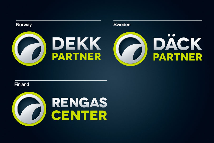
The secondary logo for all countries.
This version is to be used when a horizontal variant is most suitable. Text or graphics should come no closer to the logo than is indicated in this example. The exact distance is defined as the x height of the capital ”D” in ”DEKK” and ”DÄCK”*.
dekkpartner_secondary_logopack.zip
dackpartner_secondary_logopack.zip
rengascenter_secondary_logopack.zip
Black and white logo
The grayscale version should only be used when colour-printing is impossible.
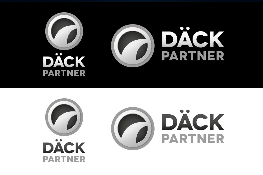
The simple version of the logo can be applied when the use of detailed logo is not allowed or possible. Examples: Together with other logos, on buildings or when sponsoring.
dekkpartner_bw_logopack.zip
dackpartner_bw_logopack.zip
rengascenter_bw_logopack.zip
Dealer name
The dealer name may co-exist with the secondary logo, or as a stand-alone element in an overall DäckPartner identity/environment. Here you can find packed files ready for print production. (The files can be viewed in programs such as MS Word, MS Powerpoint and Adobe Acrobat. Since the files are made for print you may experience small lines in the preview, these will not be present when printed.) The Zip-file includes logo with your dealer name, and your dealer name in two different colours. Please read these instructions before use.
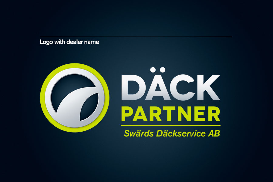
Logo with Dealer name
As the example shows the dealer name is placed underneat the secondary logo. The font used is the same as defined in the typography chapter, more precise: Akzidenz Grotesk medium italic.
Typical use is when a dealer wants to make own T-shirts or other materials where the dealer name has to be placed together with the brand-logo.
(NB! In this example the dealer name is set on one line. Some names are too long for one line, and therefore have been pre-set on two or three lines, because setting them on one line makes them too small for good visibility / reading.)
The file available is an EPS file in CMYK colours.
EPS – Scalable vector files
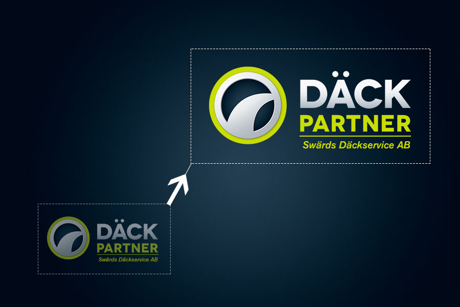
The file-format is as mentioned EPS (Encapsulated Post- Script) and can be scaled to any size without quality loss.
For screen versions (PNG) of the Däckpartner logo download the primary and secondary logo pack.
Stand alone Dealer name
The dealer names excists in two colours; Electric Green and Midnight Blue. Which one to use depends on background colour and readability. The font used is the same as defined in the typography chapter, more precise: Akzidenz Grotesk medium italic.
Typical use of the dealer name is on Advertising templates (See Advertising chapter) and on buildings (See Signage chapter).
The files available are EPS files in CMYK colours.
